| |
Many corporate brands change their logos with time to keep pace with their changing business.
Here we present the evolution of logos of 10 companies.
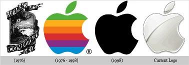
1. Apple
Steve Jobs, Steve Wozniak, and Ronald Wayne had together setup Apple in 1976, to sell their hand-built computer Apple I.
When Apple was started, the logo was a complicated picture of Isaac Newton sitting under a tree. This had been designed by Jobs and Wayne, with the inscription: 'Newton . . . A Mind Forever Voyaging Through Strange Seas of Thought . . . Alone.'
However, Jobs hired Rob Janoff to simplify the logo.
Janoff created the 'Rainbow Apple' which was the logo for company till 1998.
When Apple launched the new iMac in 1998, they changed their logo to a monochromatic apple logo.
Now, the Apple logo comes with gradient chrome silver design.
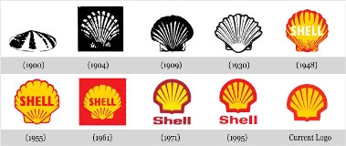 | |
In 1900, when the company was started, the logo was a realistic and simple shell which lies flat on the ground.
This was a pectin or scallop shell, but today the company has a logo which is bold, colourful and much simpler.
The evolution of the logo began after 1915.
When the company started a project in California, it added the red and yellow colors to the symbol.
These are the colours of Spain, where many Californian settlers were born.
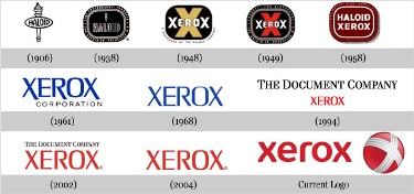 | |
The Xerox Company used to be known as the Haloid Company almost 100 years ago.
But in 1938, Chester Carlson invented xerography.
Haloid Company decided to go with Chester and made the first photocopying machine named Haloid Xerox 14.
The original Haloid word which was prominent in the company's logo before 1961 was completely replaced by Xerox.
They retained almost the same logo from 1961 to 2004.
The company changed its logo in 2008 to get away from this stereotyped image, by changing the font of the word.
They also added a ball which has a stylish X.
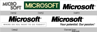 | |
The Microsoft story began in 1975, when Bill Gates and his friend Paul Allen coded the first computer language for a PC and named it BASIC.
Soon they named their partnership as Micro-Soft which explains the first logo of the company.
They changed the logo in that year itself and dropped the hyphen too.
For the next 12 years, the logo had a distinctive O.
A new logo came on in 1987.
The new logo designed by Scott Baker, came to be known as 'the Pacman logo' because of the distinctive cut in the O.
In 1994, they integrated their tagline 'Where do you want to go today?' within the logo. This was not well accepted and the company kept trying different taglines.
The new 2008 logo has all the text in Italics (including the tagline), but the look of the logo has remained pretty much the same.
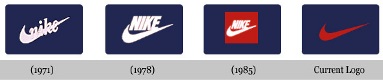 | |
Caroline Davidson designed the Nike logo for just $35 in 1971.
The main part of the logo hasn't changed with time.
As the brand gained recognition, the company name was dropped from the logo.
The company has different variations of this logo for its various departments.
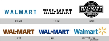 | |
The company has tried out various colours and variation of the word Walmart over the years.
In 1962, when Sam Walton started, the company logo had simply the word spelled in a very basic design.
The logo was changed in 1964, when a hyphen was added and the color was also changed from blue to black.
The 1968 logo shown here is the discount city logo, which was mainly used for uniforms, in-store signing etc, but it was never used to advertise or even in annual reports.
The 1981 logo changed the curly font to a more solid font, giving the company a more stable, established and balanced look.
The hyphen in this logo was replaced by the star in 1992, and the familiar blue colour of the logo returned for the first time after the company's inception.
The font of the current logo differs a little from the original and is indeed more stylish, but the 'Walmart' word without a break appears for the first time after 1962.
They have kept the star from 1992, but moved it to the end.
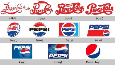 | |
Pepsi was first started by Caleb Bradham in 1890s.
Initially named as Brad's drink the name was quickly changed to Pepsi-Cola, which is visible in the first 1898 logo.
Finally in 1903, the name was trademarked and hasn't been changed till date.
In the early years, Brad made custom logos for the brand as it became more famous.
In 1933, the company was bought by Loft, Inc.
The company changed the bottle size from 6 to 12 oz. and came up with the 'Refreshing and Healthful' logo.
However, the major breakthrough in the Pepsi logo design came in 1940's.
Walter Mack, then CEO of Pepsi, came up with the idea of a new bottle design, with a crown having the Pepsi logo.
The 'Pepsi Globe' emerged when USA was in WWII, and to support the country's war efforts, Pepsi had a blue, red and white logo.
During the 1960s, the script was changed from the curly red, and the main attraction was on the bottle cap in the logo.
We see the first appearance of the Pepsi Globe instead of the bottle cap in 1973.
In 1991, the typeface was moved from inside the globe.
The red bar was lengthened and the typeface came on the top of the globe. In 1998, the white background in the logo was replaced by the blue colour, which also resulted in dropping the red horizontal band.
The globe now had 3D graphic and larger than earlier versions. It might be that since, Pepsi and the globe touch each other for the first time in the logo, the name 'the Pepsi Globe' was given to the logo.
The globe came on top of the script in 2003, and in their current logo they have done away with the script altogether.
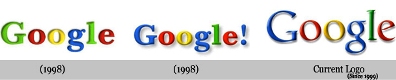 | |
The clarity of thought is visible in the company's logo right from the very beginning, when in 1996 two Stanford University computer science graduates -- Larry Page and Sergey Brin -- built the search engine.
The name of the search engine is derived from Googol (meaning one followed by 100 zeros).
Google's first logo was created by Brin, after he taught himself to use the free graphic software GIMP.
Later, an exclamation mark mimicking the Yahoo! logo was added.
In 1999, Stanford's Consultant Art Professor Ruth Kedar designed the Google logo that the company uses today.
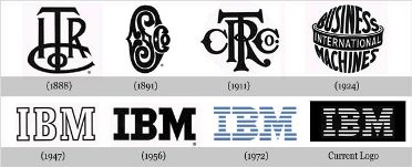 | |
IBM was earlier known as The International Time Recording Company (ITR), whose major products were mechanical time recorders, invented and patented by Willard L. Bundy in 1888.
The old logo of the company had ITR inscribed on it.
In 1911, ITR was merged with the Computing-Tabulating-Recording Company, which is why the logo had both ITR and CTR.
In 1924, the Computing-Tabulating-Recording Company adapted the name International Business Machines Corporation.
The ornate letters that formed the 'CTR' logo were replaced by the words 'Business Machines' girdled by the word 'International.'
In 1947, IBM decided to drop the globe from its logo, which was by then quite familiar among the people.
The logo was not the only change in 1947; it was accompanied by a change in business from the punched-card tabulating business to computers.
The typeface of this logo was called Beton Bold.
In 1956, before Thomas J Watson, Senior died he appointed Tom Watson, Jr. as the CEO. Tom Watson, Junior decided to project the beginning of a new era in the company, for that he changed the company's logo as well as the actions.
Paul Rand designed the new logo which represented that the changes in the company would be subtle and will not disrupt the continuity.
Also, the new logo looked more solid, grounded and balanced.
Another change in the logo was designed by Paul Rand which had stripes instead of the solid font. It depicted 'speed and dynamism'.
Since, then the logo has more or less remained the same, and the design has been recognized and replicated all over the world.
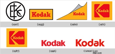 |
Kodak was the first company to integrate its name and looks into one symbol in 1907. After 1935, Kodak predominantly used yellow and red colors and the complete name of the company.
First time the Kodak name was completely written in the logo in 1935, which began the use of yellow and red colors as well.
In 1960, they tried to show a flip page as a logo, but was changed to a box and graphic 'K' element in 1971.
Again, like other companies, Kodak decided to simplify their logo in 1996, and removed the boxes.
No comments:
Post a Comment